Op de een of andere manier kwam ik de website van Seth Godin tegen en las daar een interessant artikel over Powerpoint. Een feest van herkenbaarheid: slides zijn te vol, te druk, teveel statistieken, een spreker die voorleest. Powerpoint was ooit bedoeld door ontwikkelaars om hun ideeen uit te leggen aan marketeers.
"Communication is the transfer of emotion"
De vier elementen van een goeie powerpoint presentatie:
1) maak cue cards (zorg dat je voor jezelf de feiten en statistieken in je handen hebt in notitie formaat).
2) Slides moeten je woorden versterken, niet herhalen. Waarom zou je vier bullits kunnen neerzetten dat je max 120km/u op de snelweg mag, gordel om moet doen, moet stoppen voor rood en dat er jaarlijks 540 doden vallen. Schrijf dit op je kaartjes en toon een gebotste auto waar het bloed nog uit vloeit.
3)Maak een samenvatting. Zeg van tevoren dat je een samenvatting hebt met alle stats zodat je publiek niet hoeft mee te schrijven. De presentatie is bedoeld om een boodschap over de buhne te brengen. Maar: geef deze niet vooraf, iedereen gaat alvast lezen en je aandacht is verloren.
4) Zorg voor een dealclosure. Zorg voor een stemming, deel beoordelingsformulieren uit, of vraag om een commitment en bespreek een ieders actiepunten. Laat het helpen om je project verder uit te voeren/ beslissingen te kunnen maken op crossroads etc.
31 augustus 2008
29 augustus 2008
10k run van Nike in Argentinië
Hulde voor het reclameteam van BBDO Argentinie die deze commercial heeft opgezet. Gemaakt van allemaal gekleurde plakkertjes op de ramen. Een tijdrovend karwei neem ik aan.
Labels:
Guido Gihaux
27 augustus 2008
Zen voor een business plan
Sorry, ik wil nog even ordinair quoten van een oud bericht van Guy. Hij geeft aan hoe een business plan eruit moet zien. Maar het mooie is, dat hij vanuit zijn elevator pitch adviseert pas een business case te schrijven. Heerlijk om te lezen:
Write for all the right reasons. Most people write business plans to attract investors, and while this is necessary to raise money, most venture capitalists have made a “gut level” go/no go decision during the PowerPoint pitch. Receiving (and possibly reading) the business plan is a mechanical step in due diligence. The more relevant and important reason to write is a business plan, whether you are raising money or not, is to force the management team to solidify the objectives (what), strategies (how), and tactics (when, where, who). Even if you have all the capital in the world, you should still write a business plan. Indeed, especially if you have all the capital in the world because too much capital is worse than too little.
Make it a solo effort. While creation of the business plan should be a group effort involving all the principal players in the company, the actual writing of the business plan--literally sitting down at a computer and pounding out the document--should be a solo effort. And ideally the CEO should do it because she will need to know the plan by heart......
Pitch, then plan. Most people create a business plan, and it's a piece of crap: sixty pages long, fifty-page appendix, full of buzzwords, acronyms, and superficialities like, “All we need is one percent of the market.” Then they create a PowerPoint pitch from it. The correct sequence is to perfect a pitch (10/20/30), and then write the plan from it. Write this down: A good business plan is an elaboration of a good pitch; a good pitch is not the distillation of good business plan. Why? Because it's much easier to revise a pitch than to revise a plan. Give the pitch a few times, see what works and what doesn't, change the pitch, and then write the plan. Think of your pitch as your outline, and your plan as the full text. How many people write the full text and then write the outline?
Put in the right stuff.
Here's what a business plan should address: Executive Summary (1), Problem (1), Solution (1), Business Model (1), Underlying Magic (1), Marketing and Sales (1), Competition (1), Team (1), Projections (1), Status and Timeline (1), and Conclusion (1). Essentially, this is the same list of topics as a PowerPoint pitch. Those numbers in parenthesis are the ideal lengths for each section; note that they add up to eleven. As you'll see in a few paragraphs, the ideal length of a business plan is twenty pages, so I've given you nine pages extra as a fudge factor.
Focus on the executive summary.
Keep it clean. The ideal length of a business plan is twenty pages or less, and this includes the appendix. For every ten pages over twenty pages, you decrease the likelihood that the plan will be read, much less funded, by twenty-five percent. When it comes to business plans, less is more. Many people believe that the purpose of a business plan is to create such shock and awe that investors are begging for wiring instructions; the reality is that the purpose of a a business plan is to get to the next step: continued due diligence with activities such as checking personal and customer references. The tighter the thinking, the shorter the plan; the shorter the plan, the faster it will get read.
Provide a one-page financial projection plus key metrics. Many business plans contain five year projections with a $100 million top line and such minute levels of detail that the budget for pencils is a line item. Everyone knows that you're pulling numbers out of the air that you think are large enough to be interesting, but not so large as to render urine drug-testing unnecessary. Do everyone a favor: Reduce your Excel hallucinations to one page and provide a forecast of the key metrics of your business--for example, the number of paying customers. These key metrics provide insight into your assumptions. For example, if you're assuming that you'll get twenty percent of the Fortune 500 to buy your product in the first year, I would suggest checking into a rehab program.
Write deliberate, act emergent. It means that when you write your plan, you act as if you know exactly what you're going to do. You are deliberate. You're probably wrong, but you take your best shot. However, writing deliberate doesn't mean that you adhere to the plan in the face of new information and new opportunities. As you execute the plan, you act emergent--that is, you are flexible and fast moving: changing as you learn more and more about the market. The plan, after all, should not take on a life of its own. Lees hier het hele stuk.
Labels:
business plan,
Guido Gihaux,
Guy Kawasaki
De kunst van visueel denken
We krijgen veel bezoekers over de vloer, iedereen met een briljant verhaal over wat voor zaken hij met ons kan doen. Vaak toegelicht met een een slideshow van 30 pagina's, wanneer er een business case aan te pas komt, dan moeten er nog 50 pagina's bijkomen. Maar, wat mij betreft hebben ze het redelijk mis. Hoe meer slides je nodig hebt om je product uit te leggen, hoe minder logisch het is om iemand te overtuigen.
Herken je deze afbeelding? Ik kwam hem tegen bij South West airlines. Op deze manier is SWA gepitched. Hoe simpel kan het zijn?
Dan Roam gaf in een interview met mijn held Guy Kawasaki aan hoe je het beste visueel kunt denken. Of zoals het nederlandse gezegde luidt: een beeld zegt meer dan duizend woorden. Daarom ook mijn aanrader: schaf dit boekje aan On the Back of a Napkin ehm oftewel, op de achterkant van een sigarenkistje. Ook al ben je een derderangs tekenaar, het helpt je scherper zijn in het denken in een paar stappen tegelijk.
Labels:
Dan Roam,
Guy Kawasaki,
visueel denken
mooie campagnes
Ze weten deze ouwe Lagerfeld ook wel overal voor te strikken... zou die geld nodig hebben? Of is het naar een goed doel gegaan?
Audi Side-assist. Goed bedacht, mooi uitgevoerd
Tja, en dan komt je schoonmoeder op bezoek. Scherp bedacht van het reclamebureau in Brazilie
En zie hier. het vrouwenstigma wederom bestempeld...
Leuke campagne van Guiness. Dancing with the stars, dronken editie. Kortom: don't drink and dance...
Labels:
Audi,
Guido Gihaux,
Guiness,
Lagerfeld,
schoonmoeder
21 augustus 2008
Gossip Girl season II, the trailer
Damn! Wat een heerlijke serie! Jammer dat het seizoen nu ten einde is, maar wat is dit een fantastische teaser campagne van Wongdoody uit Los Angeles. Nu maar wachten op het nieuwe seizoen...
Ben ik een kansloos??? Nope. ik hou gewoon van slechte series.... En hier vindt je de complete serie.. Seriously!
Labels:
Gossip Girl,
Guido Gihaux
18 augustus 2008
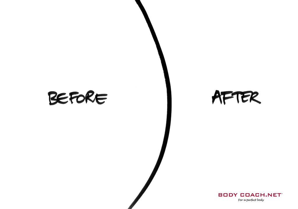
before en after
En dan huur je een bureau in, je lapt 10k aan "conceptual advertising en intellectual property" en wat krijg je ervoor terug, een lijntje en twee woorden.
Mag ik zeggen dat het Belgische bureau Guillame werkelijk briljant is? De slogan onderaan luidt trouwens "Bodycoach.net, for a perfect body". To the point
Air Canada
Het is een hele leuke campagne waarbij door de stad heen paaltjes werden geplaatst met de tekst: People working abover erop. Niets vermoedende mensen die de paaltjes tegenkomen kijken waarschijnlijk meteen naar boven maar zien niets. Geprikkeld door hun nieuwsgierigheid nemen ze de paaltjes wat beter onder de loep en zien dat Air Canada 25 vluchten per dag naar Montreal heeft.
Labels:
Air Canada
Heerlijk, bureaus die meedenken
Lekker hoor, sterk meegegaan met de propositie. Jochies van Wunderman, dit kunnen jullie ook! Zeker jij Barry!
Labels:
Guido Gihaux,
reclame
17 augustus 2008
Google phone
Het gerucht ging dat Google ook met een iPhone komt. Niet veul goeiekoper dan de iphone, maar onlangs heeft HTC het gerucht bevestigd. Apple is ondertussen rijker dan Google (nu 158 miljard dollar, tov 100 miljard aan het begin vh jaar, terwijl Google 137 miljard waard is). Webwereld wees op een klein foutje. De oorlog in Georgie was verkeerd geplaatst en Google Maps verwees naar Georgia, VS...
Heb ik ooit bij Tom Dekker (brandmanager Vrij Uit) zijn hele kantoor ondergehangen met reminders, omdat hij me misbruikte als secretaresse. Heeft Honda dat nu ook leuk gedaan in haar campagne.
Heerlijke reclame van Volkswagen. De langste Golf ooit....
Labels:
Google Maps,
Google phone,
honda,
iPhone,
Jeep,
volkswagen,
vrij uit
10 augustus 2008
Vakantietijd
Ik ben ook zoooooo twee punt nul. En ik ga je uitleggen waarom dan.
Mijn vakantie komt eraan. Canada heeer I kum. Vliegen op Boston, doorkarren naar Toronto, Quebec, Ottawa, Alconquin Park, Montreal, Niagara Falls, wijntjes proeven in de regio en terug naar Washington. Maar ik heb het echt niet ouderwets geboekt. De ingredienten: men hale vijf reisgidsjes bij de lokale boer om de hoek. Je plot de reizen over elkaar heen en pakt de highlights van de verschillende routes eruit en je maakt daarmee een eigen route aan.
Die eigen route die ik heb geboekt, die bestaat uit hotelletjes of Bed & Breakfasts via Hotels, Booking en Expedia. De hotels, de vlucht en mijn autohuur (met korting via de ANWB) heb ik doorgemaild naar support@tripit.com. Waarom?
Nou da's heel simpel: Ik heb een account aangemaakt op TripIt. Dé website waarmee je een itenary kunt maken. Een wat? Een persoonlijk reisgidsje. Alle boekingsbevestigingen slaat hij automatisch op in je dagindeling. Maar het leuke is, als mijn vlucht vertraagd is, dan krijg ik dat door op mijn persoonlijke digitale reisgids. Net als het weer, de routebeschrijving van A-B allemaal met Google Maps uitgelicht.
Maar dan zijn de randvoorwaarden voor je reis geregeld, maar wat dan. Wat ga je ter plekke doen. Welke activiteiten ontplooi je. Ik heb me geinspireerd via Tripadvisor en Virtualtourist.com, en in mindere mate met het hollandsche Zoover.nl. Van alle leuke highlights heb ik de adressen genoteerd per stad en deze ingeladen in mijn persoonlijke Google Maps. Deze plot ik in mijn Virtual Guide en voeg ik dus toe aan mijn reisgidsje.
So what?? denk je dan. Heel simpel, tripit.com kun je doorsturen naar je iPhone, naar medereizigers, naar de thuisblijvers, of simpelweg printen. Jep, old skool printen omdat je op lokatie er niets aan hebt dat je iPhone het niet doet of als je ter plekke geen internet hebt.
fijne vakansie
Labels:
Canada,
Guido Gihaux,
Tripit,
virtual tourist,
Zoover
02 augustus 2008
de dovenstichting
Goeie reclame voor de dovenstichting. Mooi vormgegeven en redelijk to the point.
Labels:
Guido Gihaux
Abonneren op:
Posts (Atom)